Page updated: 22 November 2026
Lightroom Adaptive Color Profile – Balancing Exposure and Enhancing Detail
Using Adaptive Color, Linear Gradient Masks and Basic Panel Adjustments
This is the second part of a three-part tutorial series exploring Lightroom Classic's tools for improving architectural photographs. Following the perspective correction covered in Part 1, Lightroom Transform Perspective Tutorial, this tutorial focuses on balancing exposure, enhancing image detail and refining the overall appearance of the same Budapest courtyard photograph.
Although demonstrated using an architectural photograph, the techniques covered here also have wider applications in landscape, cityscape and other types of photography.
The photograph presents two particular challenges:
- The upper part of the courtyard is considerably brighter than the lower areas, which are in deep shadow. I'll demonstrate how Lightroom's Adaptive Color Profile and a Linear Gradient mask can help balance the exposure and reveal more detail.
- A wide-angle polarizing filter has produced uneven saturation across the sky. In Part 3, I'll show you how to use a Linear Gradient mask and Lightroom's Point Color controls to make a more selective correction.
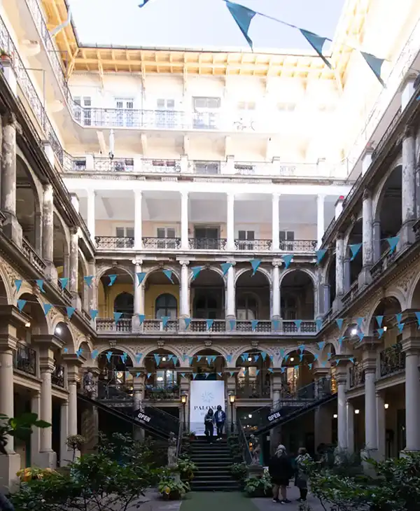 Image at the beginning of this tutorial, following the perspective correction completed in Part 1.
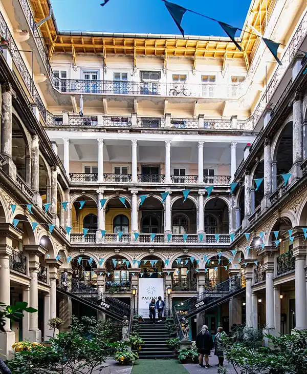 Image at the end of this tutorial, after applying Adaptive Color, a Linear Gradient mask, Dehaze, Clarity and Texture. The uneven sky will be addressed in Part 3.
ON THIS PAGE
1. Adaptive Color Profile
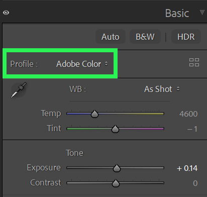 Open the Profile drop-down menu.
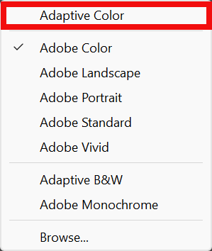 Select Adaptive Color.
Go to the Develop module. You can do this by pressing the D key or selecting Develop from the top menu.
Open the Basic panel.
Click the Profile name to display the drop-down menu of available profiles (green highlight).
Select Adaptive Color (red highlight).
2. Comparison of Profiles
Notes on the Two Images in this Comparison
No other editing has been applied to either image. The only difference is the color profile.
Adobe Color
Adobe Color is a standard profile that provides a balanced starting point for editing, with natural-looking colors, contrast and tonal range. It is designed to work well with a wide variety of photographs.
Adobe Color is commonly the default profile for RAW images, although a different profile may be displayed if one was selected previously or applied through Lightroom's import settings or an import preset.
Adaptive Color
Adaptive Color uses Adobe's image analysis technology to adjust color, tone and contrast according to the individual photograph. It aims to provide a more balanced and visually appealing starting point for editing, potentially enhancing detail, color separation and tonal definition.
The results vary depending on the photograph, but Adaptive Color can produce a noticeably different result from Adobe Color without requiring you to make individual adjustments yourself.
Tip: If you intend to use the Adaptive Color profile, apply it at the beginning of your editing process, before making other color adjustments.
3. Selecting the Linear Gradient Tool
 Masks button
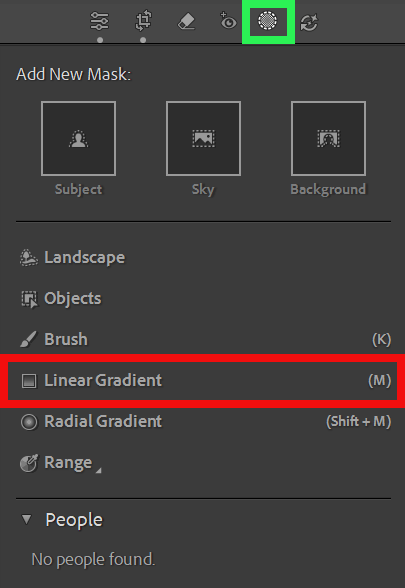 Select Linear Gradient
Select Masks (red highlight).
Choose Linear Gradient.
4. Applying a Linear Gradient to the Image
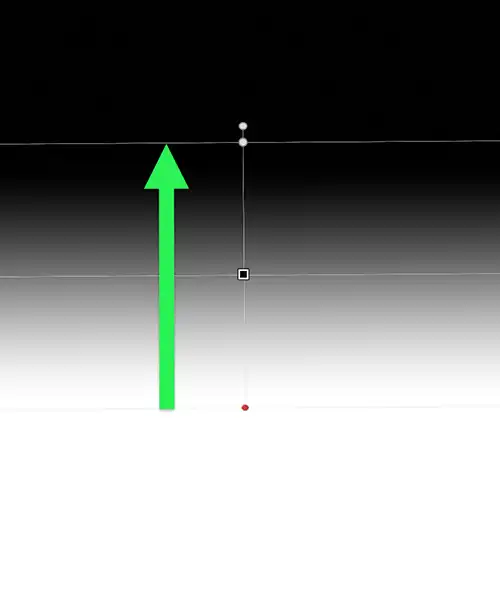 Green arrow indicates clicking outside the image to rotate the gradient.
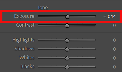 Green arrow indicates clicking outside the image to rotate the gradient.
Click and drag as illustrated by the green arrow. This indicates the direction and distance of the drag, from the starting point to the ending point.
I have increased Exposure slightly to lighten the lower part of the courtyard while maintaining a natural appearance.
When creating a Linear Gradient, the area below the starting point will be fully affected by your adjustments, as indicated by the white area.
The area above the ending point will not be affected by your adjustments, as indicated by the black area.
Between the starting point and the ending point, the effect gradually transitions from full strength to no effect, creating a smooth gradient.
Once created, you can adjust the position, shape and other aspects of the gradient.
5. Linear Gradient Comparison
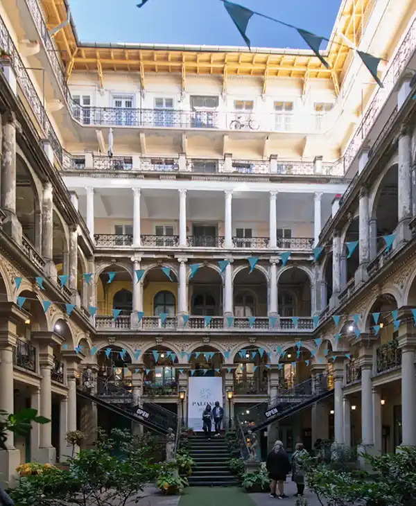
Notes on the Two Images in this Comparison
Before Gradient
The lower part of the image is in shadow because of the position of the building and the available light.
After Gradient
I have lightened the lower area slightly. I wanted to retain a realistic appearance, so the adjustment is deliberately subtle.
6. Enhancing Image Detail and Definition
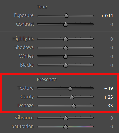 Basic panel showing the Texture, Clarity and Dehaze adjustments.
In the Basic panel, I have made the following adjustments:
- Texture: +19
- Clarity: +25
- Dehaze: +33
Increasing Texture, Clarity and Dehaze has enhanced the detail, definition and contrast in the image. Texture brings out finer detail, Clarity strengthens midtone contrast, and Dehaze reduces the appearance of haze while adding depth and contrast. Together, these adjustments give the photograph a more defined appearance.
I regularly use Texture, Clarity and Dehaze when editing landscape and cityscape photographs. This is partly a personal preference, but I find that carefully increasing these settings can make a considerable difference to the overall appearance of an image. Used subtly, they can enhance detail, definition and depth without making the adjustments themselves particularly obvious.
7. Dehaze, Clarity and Texture
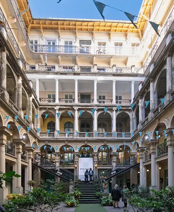
Notes on the Two Images in this Comparison
Before Texture, Clarity and Dehaze
The image before increasing Texture, Clarity and Dehaze.
After increasing Texture, Clarity and Dehaze
The adjustments add definition, contrast and depth while retaining a natural appearance.
8. Image Progress and Summary
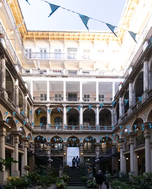 Image after Part 1 Image after Part 2
The first image shows the result after completing Part 1, Lightroom Transform Perspective Tutorial, where the perspective and composition were corrected using Lightroom's Transform tools. The second shows the progress made in this tutorial, with improvements to exposure, color and image detail.
By using the Adaptive Color profile, a Linear Gradient mask and adjustments in the Basic panel, we've improved the overall appearance of the photograph while retaining a natural look. These techniques are useful for many types of photography, particularly landscapes, architecture and cityscapes.
Although this tutorial follows on from Part 1, the techniques covered can also be used independently on your own photographs.
In Part 3, we'll address the uneven saturation across the sky. I'll demonstrate how to use a Linear Gradient mask to restrict the adjustment to the sky, then use Point Color to refine the color and even out the appearance. This also helps prevent the adjustment from affecting other blue areas elsewhere in the photograph.
