Page updated: 21 November 2026
Lightroom Perspective, Exposure & Color Editing Tutorials
A Four-Part Guide to Improving Architectural and Other Photographs
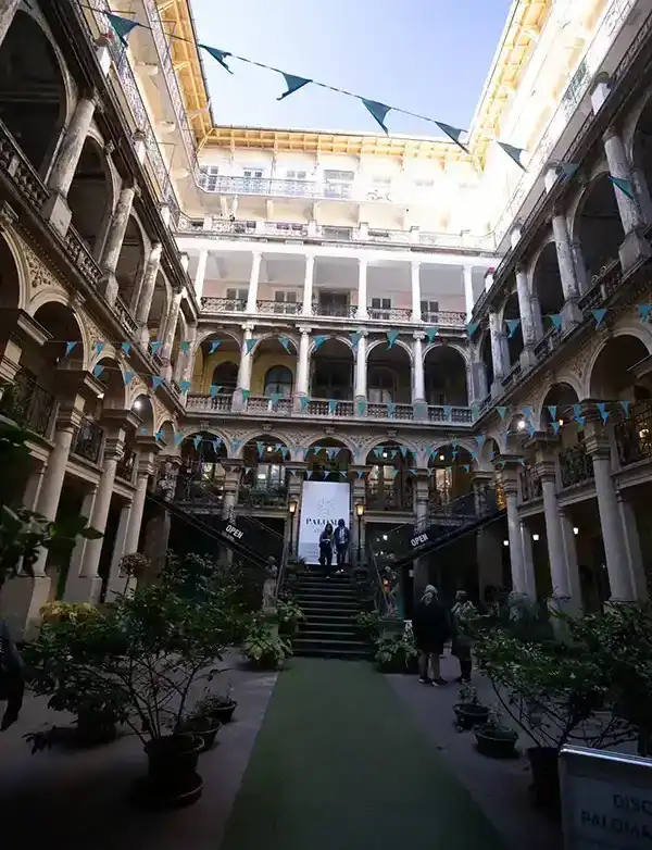
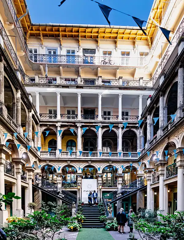
Welcome to this four-part tutorial series exploring some of Lightroom's most useful tools for improving your photographs. Aimed at beginner and intermediate users, the tutorials cover perspective correction, exposure adjustments and precise color control, using a challenging courtyard photograph as a practical example. Although each part follows on from the previous one to build a complete editing workflow, every tutorial can also be followed independently as a standalone guide to the techniques covered.
The original photograph presents several common editing challenges:
- Taken with a wide-angle lens in a confined space, the upward camera angle has caused the building's vertical lines to converge, making the structure appear to lean backwards.
- There's a significant exposure difference between the upper half of the courtyard and the lower half, which is in shadow.
- The wide-angle view introduces uneven sky saturation caused by the polarizing filter.
Across the four tutorials, I'll show you how to use Lightroom's tools to correct perspective, balance exposure and make precise color adjustments.
While the first tutorial focuses on architectural geometry, the techniques covered in Parts 2, 3 and 4 have much wider applications, including landscapes, cityscapes and other types of photography. Understanding how to control exposure and make precise color adjustments can make a considerable difference to your results.
Part 1 – Transform: Correcting Perspective and Refining Composition
Explore Lightroom's Transform tools to correct converging verticals, make minor horizontal adjustments and refine your composition. I'll also demonstrate how to use Aspect correction to add height and the Y Offset control to fine-tune the final positioning of your image.
Part 1 now available: Lightroom Transform Perspective Tutorial
Part 2 – Adaptive Color Profile: Balancing Exposure and Enhancing Image Detail
Discover how Lightroom's Adaptive Color Profile can improve the overall appearance of your photograph. Learn how to use Linear Gradient masks to balance exposure between lighter and darker areas, and how adjustments to Texture, Clarity and Dehaze can enhance detail, definition and depth.
Part 2 now available: Lightroom Adaptive Color Profile
Part 3 – Lightroom Point Color: Understanding Color Selection, Variance and Range
Explore Lightroom's Point Color controls and learn how to select individual colors for precise adjustments. I'll explain how Hue, Saturation and Luminance affect selected colors, and demonstrate how the Variance and Range controls influence color selection and the areas affected by your adjustments. Comparison rollovers will help illustrate some of the more subtle differences between these settings.
Part 3 coming soon.
Part 4 – Point Color Masks: Making Precise and Selective Color Adjustments
Put Lightroom's Point Color tools into practice to make targeted color adjustments within your photograph. I'll demonstrate how to reduce unwanted blue color spill on building surfaces, as well as selectively increase blue saturation in smaller details such as flags, without unnecessarily affecting surrounding areas.
Part 4 coming soon.
