A Great Technique to Replace Color in an Object
This is a better technique to replace color in an object, than the Color Replacement tool.
This method is quicker, more accurate, non-destructive and much more flexible.
The method relies on making a good quality selection. The obvious choice for the best selection tool is usually the Object Selection Tool, which in many cases is great, but in this task we only want to select part of the car, so a more effective tool is the Quick Selection tool. There are many times when this tool is required, so as well as this task is about replacing colour, it's also a good tutorial on how to use the Quick Selection tool.
How to Change the Color of an Object
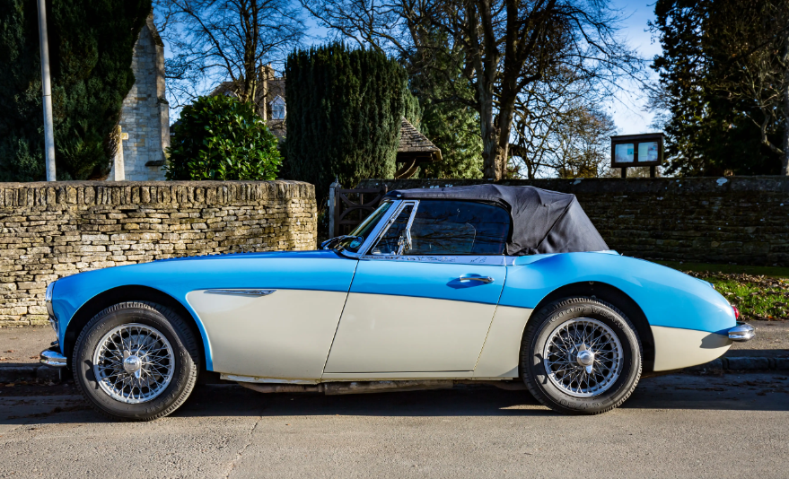
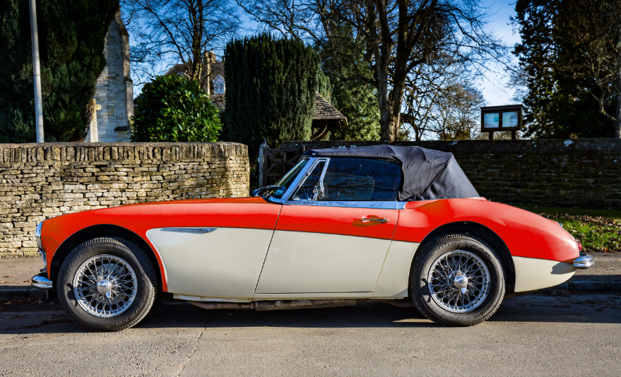

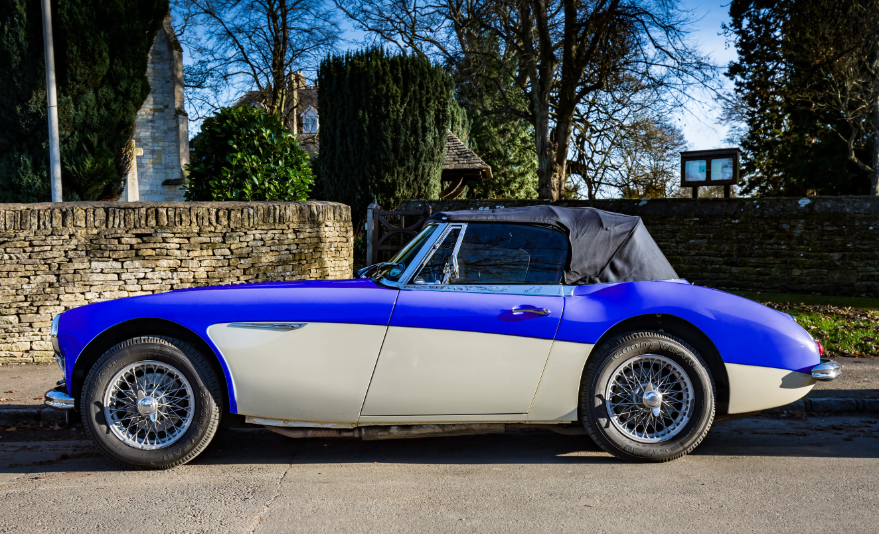
We will change the color of the car from its original light blue to any color you like.
Step 1

Select the Object Selection Tool from the toolbar. Like most tools, it shares the button with other tools and the one that is visible will be the last tool used.
Although this isn't the best tool for this particular task, I recommend it being the first tool to try when making a selection of an object. This task highlights one reason it won't always be the best tool.
Step 2
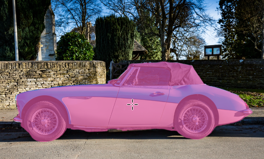
Move the cursor over the object and wait a moment. The object is automatically highlighted in pink, which indicates what would be selected if you clicked.
The Object Selection tool does a great job of selecting the car, but the problem is that we only want to select a part of the car.
Step 3

So instead, select the Quick Selection Tool, which shares the button with the Object Selection Tool. For years, before the Object Selection tool existed, this has been my go-to selection tool. It's a great selection tool, but note, for good results you must use it in the "correct" way, as I will describe below.
Step 4
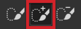
The Quick Selection tool has 3 buttons. Most of the other selection tools have 4 buttons, but the one that's missing is never used for selecting objects.
Select the 2nd button. This will Add to Seletion, so you can make your selection in multiple go's.
The 1st button creates a new selection each time you click, which cancels any existing selections. The 3rd button is Subtract from Selection, which we'll need, but a better keyboard alternative, if you have a keyboard, is to press and hold the Alt key, which temporarily selects the Subtract from Selection button.
Step 5
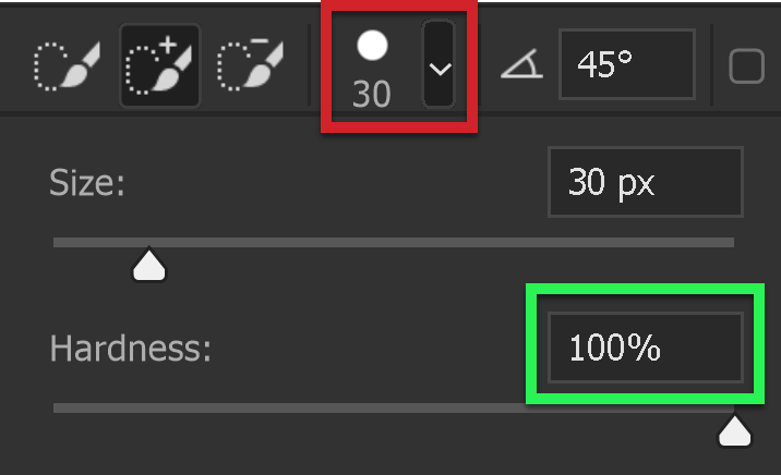
Select the Brush Options button on the Options bar (highlighted in red) and set brush hardness to 100% (highlighted in green).
For most brush based tools, I would never use at 100% hardness, because it would make it hard (impossible?) to blend your editing into the image so your editing was unnoticable.
However the Quick Selection tool is not brushing edits on your image. It is creating a selection. The hard edge allows you to accurately click right up to an edge, with the full confidence that you are not selecting over the edge. This is important. If you don't pay attention and accidentally click over an edge, you will be teaching the tool to select areas that you don't want.
Step 6

Also, on the Options bar, tick the Enhance Edge box. The only reason not to select this is if you have an older laptop or computer, or it has a low powered graphics card. Tick the box, but if it slows your machine down, then consider unticking it.
If you are able to use this, just leave it selected and forget about it. It will give yuo a higher quality selection.
Step 7
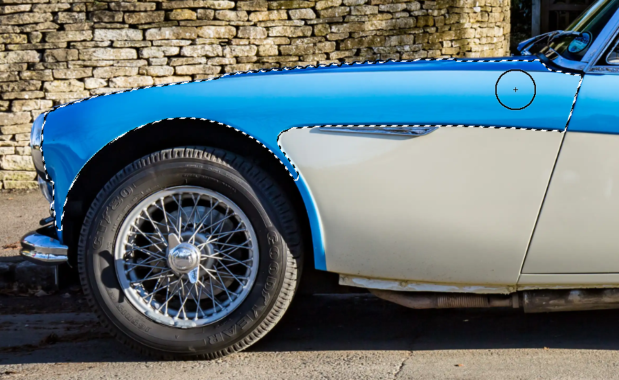
The screenshot shows my brush and where I clicked once. The selected area is shown by the "marching ants". As you can see, it did a good job of automatically selecting the area of blue at the front of the car.
Step 8

Next, I've moved along the car and the screenshot shows where I clicked (once) and the resulting additional selection (because I selected the 2nd selection button to Add to Selection, as detailed in Step 4.
Step 9
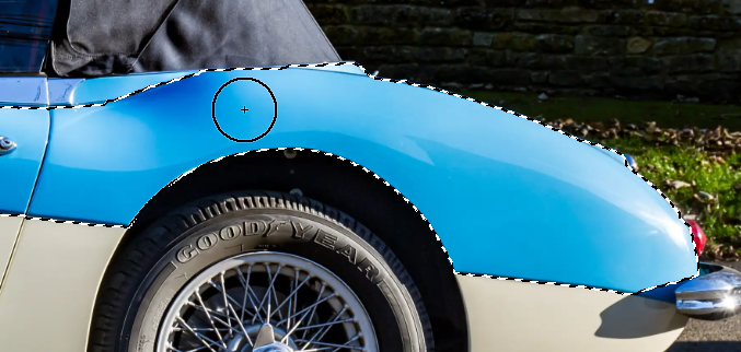
The screenshot shows where I clicked next (once) and the resulting selection.
Step 10

There was a small area that wasn't selected, so one click and it's now added to the selection.
Step 11

The area on top of the bonnet (that's UK speak for hood) of the car shows a very small area that is not yet selected. Because I have a brush with 100% hardness, I can click with confidence, on this area, knowing I wont' be inadvertantly selecting outside my target area (which I probably would be if I was using a soft brush).
Step 12
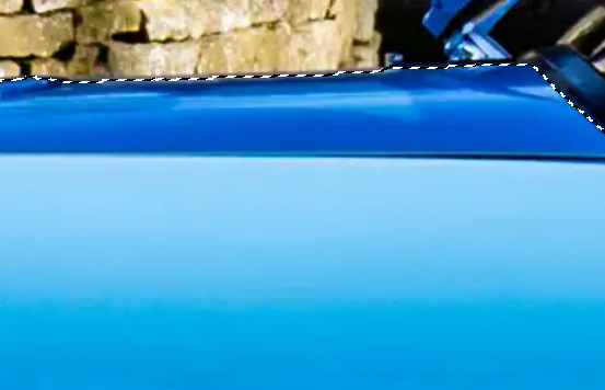
Two careful clicks and this is the result of that area.
Step 13

Next is the small area of blue, to the right of the front wheel. Reduce brush size appropriately and one click in this spot was all it took. See the next screenshot.
Step 14
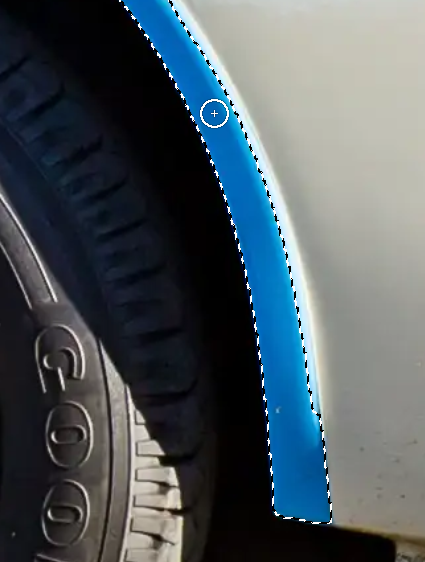
One click, as shown by the brush cursor, selected the whole area.
Step 15

Another area that needs attention is at the front of the car.
Step 16

Zoom in a lot. You must zoom in to see things clearly and work accurately.
This was a top reason why many students in my classrooms didn't achieve good results. Despite my urging and reminders, they consistently don't zoom in enough.
To make this easy, ensure your Scroll Wheel (if you have a mouse), is set to Zoom. You can set this in Edit > Preferences > Tools > Zoom With Scroll Wheel.
Reduce brush size accordingly.
Step 17

This step is important. Don't ignore.
When you click in the blue of the car, because it's dark, an unwanted dark area is also selected. This is normal when using the Quick Selection tool.
DON'T UNDO. That is a typical response when you see something you don't want. But that's not how to use the Quick Selection tool. If you Undo, you will get the same result next time you click on the blue.
Instead, you must teach the Quick Selection tool what you want and in this case, what you don't want.
Either select the Subtract From Selection button from the Options bar, or if you have a keyboard, a better alternative is to press and hold the Alt key. While the Alt key is pressed, it turns the tool into the Subtract From Selection mode (you can see the Subtract button selected on the toolbar). Also note the minus symbol (-) visible in the brush while you work.
Click, or click and drag in the areas that you don't want . Be careful not to accidentally let any part of the brush (100% hardness, so we know it's accurate at the edge), touch any part of areas that you DO want.
Step 18

A few accurate clicks and this is the result. The unwanted areas have been subtracted from the selection.
Step 19
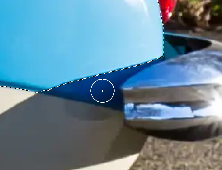
At the rear of the car we also need to select the dark area. One click, as shown, was all it took.
Step 20
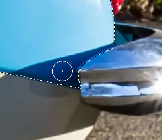
One click, as shown, resulted in the dark area being added to the selection.
At this point, when we think our selection is complete, it's always a good idea to have a close look at the complete selection.
Zoom in sufficiently and pan around the image to inspect. You could select the Hand tool from the toolbar, but a far better alternative, if you have a keyboard, is to hold down the Spacebar (the long key) and click and drag to move around the image.
Alternatively, you can use the Navigator Panel to pan around the image.Step 21

This is how your Background layer in the Layers panel will look before the next step.
Step 22
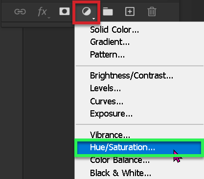
Click on the Adjustment Layers icon, as highlighted in red.
Select Hue/Saturation, as highlighted in green.
Step 23

A Hue/Saturation Adjustment Layer has been added above the background layer. Whenever you add a layer, it is always added above the selected layer.
Step 24

The Properties Panel shows the Hue/Saturation controls.
If the Hue/Saturation Adjustment Layer is not visible, you can open it from the Windows menu.
This is how it looks before any adjustments are made.
Step 25
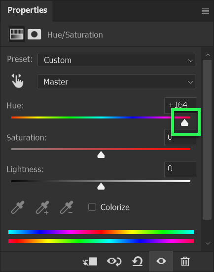
Click and drag on the Hue slider (highlighted in green) to the right to achieve a red color.
The Hue slider indicates colors within it, but you will see a real-time preview on your image as you drag the slider. So you can gauge the color, just by looking at the image.
Step 26

Here is the result of the previous step.
Step 27
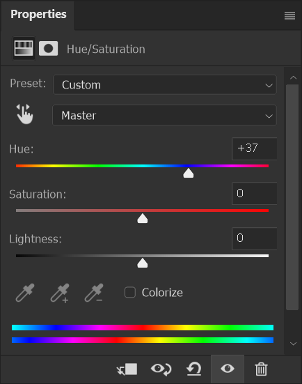
This screenshot shows that I've dragged the Hue slider to a dark blue and the image is shown in the next step.
Step 28

This is how the image looks as a result of the previous step.
Step 29
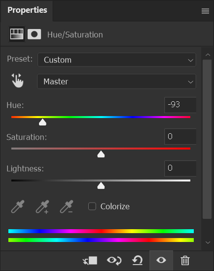
Let's try one more color. This time I'll drag the Hue slider to the left, to a bright green color.
Step 30

And here is the result.
Step 31

At any time, if you want to show the original image, you can simply "hide", or turn off, the Hue/Saturation Adjustment Layer by clicking the "eye icon" at the left of the layer. You will then see the original.
This screenshot shows the Hue/Saturation Adjustment layer as visible. Therefore it's effect will be seen in the image.
Step 31

This screenshot shows the Hue/Saturation Adjustment layer as hidden (turned off). Therefore it's effect will not be seen in the image.
Step 31

This is the result of "turning off" the Hue/Saturation Adjustment Layer. You will see the original.
The Hue/Saturation Adjustment Layer still retains whatever settings you chose, but it's not visible and not applying itself to the image.
Summary
This technique is better for replacing color than the Color Replacement Tool. It is far more flexible. Once the selection is made (and with this image, that was far quicker with the Quick Selection Tool), you can then apply a Hue/Saturation Adjustment layer. This has the huge advantages that it is non-destructive, permanently editable and you can quickly and simply turn the effect on or off. If you wish to edit it, it is so quick and easy to make changes to the color. That is not the case with the Color Replacement tool.
The Color Replacement Tool, because of its name, might suggest that it's a great tool to replace color. That is not the case. Yes, it does replace color and in simple situations, that could be sufficient, but the tool works destructively and that's generally not a good thing when you're editing images. It's far better to edit non-destructively, so your editing is flexible and can be revisited and elements changed.

