Page updated: 29 March 2026
Adjustment Layers
How to edit Non-destructively in Photoshop
Adjustment Layers are an excellent method of applying various edits to your image, non-destructively. Adjustment Layers do not make changes directly to the image pixels, so any changes are permanently editable, without loss of quality. This is a flexible and ideal way to edit images. The edits are stored in the Adjustment Layer itself and not in the image layer. So there is no need to make a duplicate layer, as you should do if editing layer pixels directly (non-destructive editing).
This guide builds on the Layers Basics guide. If you are not familiar with Layers, please see the Layers Basics Guide.
Adjustment Layers allow you to make many different types of edits to your image, such as exposure, brightness, contrast, colors, adding a gradient or pattern, and more. See the screenshot (right or below) for the full list of Adjustment Layers.
You can use multiple Adjustment Layers, either of different types, or multiple Adjustment Layers of the same type. By default Adjustment Layers will affect all layers beneath it, although you can "clip" an Adjustment Layer to an image layer, so it only affects that layer.
For a fuller explanation and example of the benefits of non-destructive editing, see Destructive vs Non-Destructive Editing.
Related subjects;
Layers Basics
Layer Masks
The Histogram
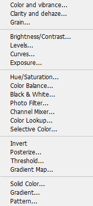
Many different Adjustment Layers
ON THIS PAGE
How to Use Adjustment Layers

This image of a giraffe is underexposed. We will improve brightness and contrast by using a Levels Adjustment Layer, which is a great way to adjust brightness, contrast and sometimes improve color.
Adjustment Layers are non-destructive. That is, they do not change the image layer. Provided the image is saved in a format that supports layers, such as .psd, or .tif, the adjustment layer can be edited at any time in the future, without loss of quality.
1. Select an Adjustment Layer

Click on the Adjustment Layer button, at the bottom of the Layers panel.
If you can't see the Layers panel, you can open it from the Window menu.
2. Levels Adjustment Layer

Select Levels from the list of Adjustment Layers.
Levels is a good method to improve brightness and contrast. Some knowledge of the Histogram is useful, but even without that, it offers tools to guide your adjustments.
It's a much better method than using the Brightness/Contrast Adjustment Layer, which offers no guidance as to how much to adjust brightness and contrast.
In older versions of Photoshop the list of Adjustment Layers will look slightly different. Solid Color, Gradient and Pattern were shown at the top, instead of the bottom. Vibrance has changed into Color and Vibrance and Clarity and dhaze, and Grain are new adjustment layers.
3. Auto Levels


As a first step, you could try Auto. Just click the Auto button and see what you get.
In this case, the image has been improved, though not as much as we can by adjusting Levels manually. So that's what I'll do next.
4. The Histogram
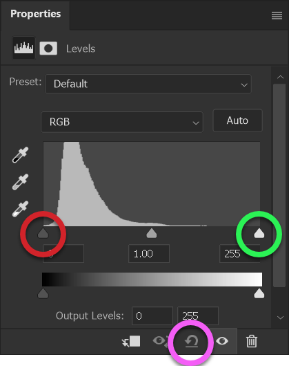

I have reset Levels by clicking the reset button (highlighted in pink).
There are 3 sliders under the Histogram. The black slider is highlighted in red and the white slider is highlighted in green. The middle slider is gray (not highlighted).
The Histogram is basically a column chart with 256 columns, indicating how many pixels there are in each of the 256 tones from pure black to pure white (in an 8-bit image). For a detailed description of the Histogram, see The Histogram.
Any white pixels in the image would be represented by a column above the white slider. The image is under exposed, so all areas are darker than they should be.
5. Editing the Histogram


I have dragged the white slider to where the data begins in the Histogram. Pixels level with the white slider, highlighted in green, (and to the right of it, if there were any), are now pure white. To view this clearly there is also a magnified Histogram without distractions.
I have not moved the black or gray slider. The gray slider has moved on it's own, as a result of the white slider moving. It remains in the middle of the new positions.
The image is improved, and more so than by just clicking on the Auto button, as I did earlier.
6. Using the Histogram data to adjust the white point
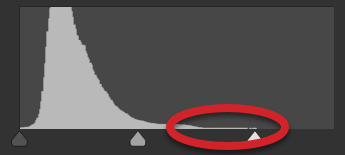
The very little amount of data, (inside the red line), shows that there is very little white in the image.
The image still looks a bit dull, so we could try moving the white slider further to the left, to brighten the image more.
7. Edited Histogram

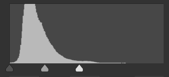
I have moved the white slider to the left. All pixels level with the white slider and to the right of it are now pure white. The image is brighter.
The pixels to the right of the white slider are pure white, so they will have lost detail. We can use Levels and the Histogram to inspect and see precisely where we are losing detail.
8. View a Preview of your Edit
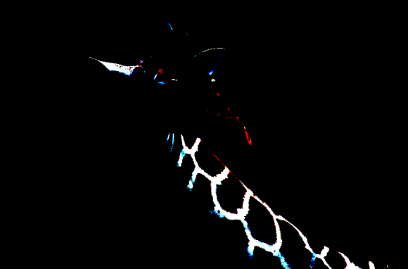

Press and hold down the Alt key, whilst also at the same time clicking and holding the mouse button down on the white slider, to see a preview of where you are losing detail in the white areas.
The black parts of the preview indicate no detail is lost in those areas.
The white parts of the preview show where you are losing detail in all three color channels; red, green and blue.
9. Editing with Preview
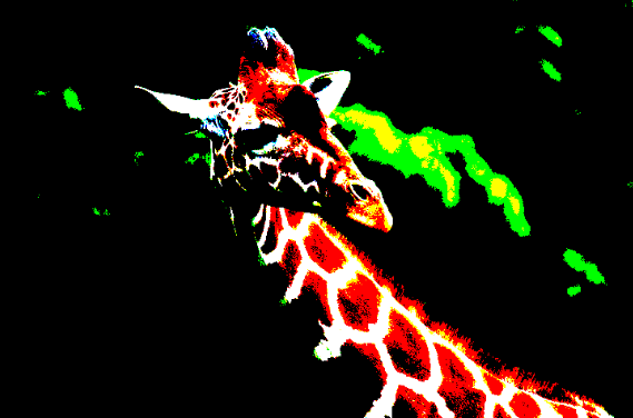


To further demonstrate how you can preview your adjustment, I have dragged the white slider even further to the left, far beyond what is correct. Holding down the Alt key and keeping the mouse button pressed on the white slider shows a preview of where I am losing detail. The red areas show detail lost in the red channel, the green areas show detail lost in the green channel and the white areas show detail lost in all three color channels.
This is all clearly visible in the image.
If you keep the Alt key pressed, as you drag the white slider, you can see the changes in real time. This is an excellent device to make adjustments accurately, so you don't lose important detail in highlights or shadows. If you do choose to lose some detail, at least you can see exactly where you will lose it.
10. Editing with Preview continued


Because you can see the changes in real time (Alt key and mouse button pressed), while dragging the white slider, you can be precise about where you drag the slider. Depending on your image and your preference for that image, you can choose not to lose any detail at all, or choose to lose a little detail for the sake of a brighter image.
So, let's go and adjust this "correctly".
11. Realistic editing with Preview
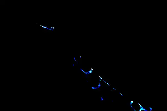

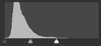
I have dragged the white slider as shown and the preview shows I'm losing a small amount of detail in those white areas. I can accept this because they are small areas and I have retained full detail in the majority of the white areas.
Using the preview, it gives you the information to make the decision that you are happy with in each image. This does absolutely not apply if using the Brightness/Contrast Adjustment Layer.
OK, I'm happy I've adjusted the white slider as far as I want, but what about the black slider?
12. Editing the Black Point with Preview
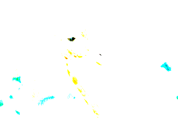

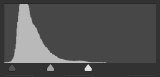
I have dragged the black slider slightly to the right. The Histogram tells us that there are a lot more dark pixels and the small amount on the very left is quite short.
The preview for the black slider is the opposite of the white slider. Areas in white indicate no detail is lost. Areas of black indicate detail lost in the shadow areas, which in this image is the giraffe's eye. The colors visible indicate detail lost in the color channels.
I like the punchier image, with the blacks being darker. The only area of concern is the giraffe's eye. But on inspection, there is not much detail in the original unedited image, so I'm happy with this result. We could fix this with a second Levels Adjustment Layer and Layer Mask to lighten just the eye, but that's beyond the scope of this tutorial.
13. Comparing original vs Edited


Here are the original and edited images, so you can see the difference.
14. Close-ups of comparison


Here is the difference between retaining the detail and overexposing the detail.
15. Editing an existing Adjustment Layer
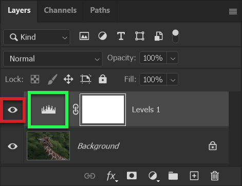
Having made the above edits, you can always adjust these edits, without loss of quality, at any time in the future, provided you save the document as a .psd file, or a .tif file. These formats both support layers.
You can turn the Adjustment Layer on or off by clicking the "eye" icon (highlighted in red).
If you chose Save As, or exported the file to the jpeg format, the image would be saved as you see it, but you would not have access to the adjustment layer.
To edit the Adjustment Layer, double click the layer thumbnail, (highlighted in green). You will then see the Histogram exactly as you last edited it. You can make changes without losing quality and it remains editable for ever.
16. Clip an Adjustment Layer


To demonstrate how to clip an Adjustment Layer, so that it only affects the layer (or layers that it is clipped to), I have created a duplicate layer of the giraffe and removed the background
17. Clip an Adjustment Layer


Clipping an Adjustment Layer means that it will only be applied to the layer(s) below it, that it is clipped to. Unlike an unclipped Adjustment Layer, it will not affect any other layers below it in the layer stack.
The Meerkat is on its own layer and the background is a pale green Solid Color Adjustment Layer.
18. Clip an Adjustment Layer


A Levels Adjustment Layer has been added and the black slider moved to the right (green highlight) to darken the image and increase contrast. Note that this adjustment is for illustration purposes, it is not a good adjustment.
Both layers beneath the Levels Adjustment Layer have been darkened; the meerkat and the green background.
19. Clip an Adjustment Layer


To clip the Adjustment Layer, click on the Clipping button (red highlight). This acts as a switch. Click to turn on clipping (highlighted in a lighter gray), or click to turn off clipping. The keyboard shortcut is to press and hold the Alt key while clicking on the join between the Adjustment Layer and the layer beneath.
The meerkat is darkened, the same as in the previous step. The background is unchanged, as in the original.
20. Save in PSD format
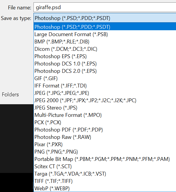
To ensure you preserve the Adjustment Layer, so that you can edit it in the future, you must save your file in a format that supports layers, such as Photoshop's native .psd format, or the .tif format. Jpeg does not support layers.
From the File menu, select Save As. If you have added layers, Photoshop will automatically select the .psd option. I recommend accepting this. I also recommend not changing the filename, as it will identify with the original image file.
Summary of Adjustment Layers
Adjustment Layers are an excellent way to edit your image non-destructively. You can edit them at any time, without loss of quality, provided you save the file in one of the .psd or .tif formats.
For more information see Destructive vs Non-Destructive Editing and Image Formats.
There is more to using and working with Adjustment Layers. You can use multiple Adjustment Layers on one image, especially if you use Layer Masks, which are automatically included with each Adjustment Layer.
